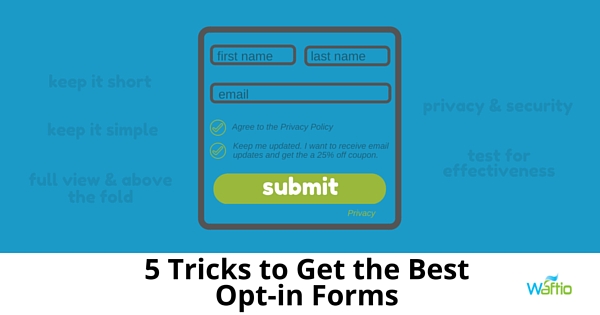
One of the biggest mistakes you can make as a marketer is assuming that if a lead has clicked on your call-to-action, they are as good as converted. The lead still has to fill out your form, which means they can still change their mind and leave your page.
If you find the number of views of your landing page is substantially larger than your lead captures, there could be a problem with your form.
Here are some of the common reasons why your opt-in form is failing to capture leads:
1. You’re asking for too much information
The shorter your form, the more willing people will be to complete it. If the form looks like a test, most will skip it. You should limit the form to 2 to 3 fields. People don’t have patience, and the last thing they’re going to do is take the time to answer lots of questions.
2. You’re asking for information that’s too personal
Most people are uncomfortable giving personal information via the internet. Obviously, you have to ask for a name and email address. Most people realize they have to provide this information.
However, you shouldn’t ask for other information, like phone numbers and company names. This makes people uncomfortable – especially since there are a lot of websites that the sell information they collect.
3. Your leads don’t feel secure
Almost everybody will have second thoughts before they fill out a form on a website. Do they really want to provide you with information that you can use to spam them?
Demonstrate the safety and security of your site to help alleviate these fears by including the following:
- Social Proof – Add social proof to your landing page. Add the number of shares or likes the landing page has gotten, the number of downloads you’ve gotten (if you’re offering free downloadable content in exchange for filling out the form) or even customer testimonials.
- Privacy Policy – Provide a link to your privacy policy to reassure leads you won’t sell their personal information. A good place to put the link is under the field asking for their email address.
- Authority Endorsement – Any endorsements from an authoritative source, guarantees or third-party security certifications should be displayed on the form.
4. You’re not positioning the form above the fold
When a lead arrives on your landing page, make sure your form is in full view. A lead should not have to scroll down the page in search of the form; there’s a chance that they may get distracted and simply forget why they’re there. Always position your form above the fold (meaning the visible area on a web page) so your leads don’t have to search to find it.
5. You’re not testing your forms
Use variations of your forms and do A/B testing to determine which variation is more effective at capturing leads.
Don’t underestimate the importance of your opt-in forms when it comes to capturing leads. Be sure to avoid some of these more common mistakes to make sure your forms are efficient.

Author: Mike Gingerich, President of web firm Digital Hill, Co-Founder of TabSite .
Digital and Social Media Marketer, Speaker, and Business Consultant. Part geek, part marketer, total digital junkie! Seeking to add value, make the complex simple, and leave a positive impact.
Follow me on twitter: @mike_gingerich.


