Author Archives: Mike Gingerich

About Mike Gingerich

Author: Mike Gingerich, President of web firm Digital Hill, Co-Founder of TabSite . Digital and Social Media Marketer, Speaker, and Business Consultant. Part geek, part marketer, total digital junkie! Seeking to add value, make the complex simple, and leave a positive impact. Follow me on twitter: @mike_gingerich.

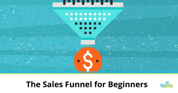
The Sales Funnel for Beginners

The Sales Funnel for Beginners
If you spend any amount of time researching online marketing, chances are you’re going to encounter the term “sales funnel.” It’s not a new term, but if it’s new to you, then you’ve come to the right place! This is everything you need to know about sales funnels.

Stages of Purchasing

Sales funnels are built around the accepted notions that people need multiple interactions with a brand or product before they purchase and that there are several stages to the purchasing process.

Awareness

Awareness is the first stage of the sales funnel. It’s very much advertising driven. At this stage, new customers who’ve never heard of you see ads or articles about your products.

Interest

If you’ve ever heard that it’s the visitors that return to your website that count this is what they’re talking about.

Interest is when people who visited your site once, as the result of an ad, make a repeat visit (or 6!) They read articles, look at reviews and product data, and immerse themselves more in your products and services.

Decision

After enough contact with your company via your website, reading articles and reviews, and hearing good things about you, eventually, customers reach the stage where they will make a decision.

They might be looking at more than one option. If you’re credible, your products and services are high quality and meet their needs; chances are, they will purchase from you.

Action

Action is the last step of the customer driven sales funnel. This is where orders are made, payments exchanged, and delivery details agreed upon. This is a big step for any customer, so make it as easy as possible.

Use large, clear, easy to find buttons to direct customers to your online store or contact page. Offer multiple payment options.

After Sales

Many people forget this crucial step in the sales funnel, but you’ll do a lot better if you don’t! The truth is, the sales process doesn’t end when you’ve taken payment or delivered the item in question.

Follow up with customers after sales, stay in touch and keep them up to date with new products and deals is a great way to boost your bottom line.

Make sure you automate the after sales marketing to existing customers process and keep them coming back, time and time again!

How to Create an Ebook as an Opt-In Offer

How to Create an Ebook as an Opt-In Offer
When building your email list, the best way to increase subscribers is by offering something in exchange for their email address. This needs to be more than a basic “Sign up for our newsletter!” call to action. People have no idea what to expect from your newsletter. So even if it’s full of valuable content, you need to offer more to get their email address. Create an ebook opt-in offer.

There are many different options for an opt-in offer, eBooks, white papers, free video webinars. But an ebook is a very powerful option. Typically it’s around 25 pages and covers a single topic your audience is interested in.

If you’re ready to create your first ebook, check out our tips below.

1. Pick your a Relevant Topic.

Pick a topic that’s relevant to your business. What’s something your target market would be interested in learning more about? What question do you get asked most? That’s a great topic for your eBook.

For a digital marketing agency, an ebook about Facebook ads or creating a social media strategy. A contractor might have an ebook about minor fixes homeowners can do themselves. A credit union might have an ebook about repairing your credit.

It’s important to give away valuable information in your opt-in ebook, but not too much information that they don’t buy from you.

2. Outline your ebook.

Since ebooks are much longer pieces of content than a typical blog article, the best way to get started is by creating an outline. Write the main points you want to make and include a few bullets about each one.

The best way to outline your ebook is by dedicating a separate chapter to each subtopic, then cover each subtopic thoroughly.

3. Flesh out your points.

Now write your ebook! Take the outline you’ve created, write your introduction, and flesh out each of your chapters, subheadings, and bullet points.

Include a call-to-action to your products/services in your conclusion to let each of your new email subscribers know what next steps to take after reading your ebook.

4. Proofread and edit your ebook.

Proofreading and editing anything you write is always crucial. Sentences that may have made sense when you initially wrote them might need some cleanup after rereading them. Once you’ve finished writing, set it aside for a few days before coming back to edit. It’s always a good idea to let it stew before revisiting it.

5. Design your ebook.

This can be one of the most difficult parts. You want your ebook to be engaging and compelling. It requires more design than a regular blog post. You want to make it easy to read and aesthetically pleasing. Don’t slap a bunch of words onto a Microsoft Word document and export it as a PDF.

Here’s a great tool to create your own eBook, https://MyeBookMaker.com.

Once you’ve finished your design, export it as a PDF, and you’re ready to get started increasing email subscriptions with your new ebook opt-in offer. Create a pop-up on your website and a landing page that includes a thank you and link to download the eBook for new subscribers.

Why People Unsubscribe from Your Email List

Why People Unsubscribe from Your Email List
It’s challenging enough to get people to subscribe to your mailing list, so when they start unsubscribing at a noticeable rate, it’s hard not to worry. Are you doing anything wrong? The likely answer is yes. But don’t fret! The usual reasons people unsubscribe can be addressed in the following ways:

Reason: You send too many emails

Whenever people access their inbox, they have several messages from you.  If this happens too often, they start feeling overwhelmed. Tired of deleting emails, the only other way out is to unsubscribe.

Solution: Give delivery options.

Let people choose how often they hear from you. Some prefer weekly; others want monthly. Some want to be updated right away, while others just want a summary of highlights. Different strokes for different folks, so provide several options they can choose from. And stop sending messages several times a day!

Reason: You send too few emails.

Not sending enough emails is just as bad as sending too many. When people hardly hear from you, they don’t remember they subscribed, so they unsubscribe or even worse, report you as spam. As expected, balance is important.

Solution: Stick to a consistent schedule.

Life can get in the way of email-writing, but try to follow a publication schedule. Even if you send emails twice a month, it establishes a pattern people can recognize, and they know when to expect to hear from you.

But what if it isn’t you, it’s them? There’s still something you can do:

Reason: They signed up by mistake.

It’s easy to click on the wrong buttons on smartphones and tablets. The result is people subscribing to newsletters they never intended to join in the first place. They only realize what happened when they get messages from you.

Solution: Use a double opt-in form.

These people aren’t major losses because they won’t become conversions, but they skew your marketing data. To prevent accidental signups, use a double opt-in form that confirms their subscription.  This ensures that all members of your mailing list are either potential or existing customers.

Reason: They canceled by mistake.

Again, we can blame the small screens of mobile devices for the increasing number of accidental cancellation.  People who don’t plan to unsubscribe still leave your email list because they didn’t realize what they’ve done. They’ll just wonder why they haven’t heard from you and assume you’re too busy.

Solution: Use a double opt-out form

If you ask people to confirm their subscription, then it makes sense to confirm their cancellation. Otherwise, you’d lose a good lead, and that’s a shame. Only those who intend to leave your mailing list will go through the whole process of opting out.

Reason: Your content is too sales-y.

People who knowingly joined your mailing list did so because they want to get relevant content from you. So if you bombard them with ad after ad and not much else, they’ll unsubscribe.

Solution: Deliver content your subscribers find useful.

Soft sell is the way to go when communicating with your subscribers. They’re more likely to respond positively if you give them what they want first, which is information they’ve been looking for.

Building your mailing list is not just about getting new subscribers. It’s also about retaining the ones you already have. Work on both, and you’ll see considerable growth in your subscriptions.

Increase Your Email Subscribers with Your Blog Articles

Increase Your Email Subscribers with Your Blog Articles
It’s the digital marketer’s mantra: the real power is in the list. You’ve got one shot to impress a website visitor, but endless opportunities to reach out to your email list subscribers.

Blogs are a great way to capture interest and email addresses, but if yours isn’t exactly a gold mine of signups, then it’s time to make a few tweaks. Our recommendations are:

1. Get Responsive!

Responsive design is so critical that Google and other search engines are penalizing sites that aren’t mobile-friendly, and accessible across platforms. More important than that: if your readers can’t access your blog on their phone, they will go elsewhere.

2. Put Opt-In Forms on Every Page

No one is going to look for your opt-in form. Make it easy. Use simple text. Ask for as little information as possible. Add a big, easy to click button. Finally, put it above the fold.

Did you know that the old “sidebar” forms don’t really work optimally anymore?  It’s good to have one but you need something more to “get in front of” the visitor more clearly.

3. Use the “Skyscraper Method”

The Skyscraper Method technique was developed by Brian Dean of Backlinko, and it’s very simple and very effective.

  • Find the very best content in your niche
  • Figure out how to rework it, rewrite it, and make it BETTER
  • Post your new, improved, viral-ready and completely shareable link bait on your blog
  • Repeat

4. Help People Find What They Need

Even if you have a blog that is Shakespeare worthy in style and has the depth of Neil deGrasse Tyson explaining quasars, you’re not going to get the traction you should be out of it if people struggle to find their way around.

Make sure your navigation is simple and intuitive, and place a search box in a prominent and easy to find place on every page.

5. Add A CTA to Every Post

If you don’t get them to sign up before they read your post, make sure you catch them at the end, by including a call to action (CTA) inviting subscription at the end of your posts.

6. Add a Bounce Popup

Good salespeople never give up, and neither should your site. If your opt-in forms haven’t captured their information, and your CTA fails, add a popup to your site that only appears when people are about to leave without signing up.

Chances are, most visitors who leave won’t come back soon, so you have nothing to lose by disrupting them, and asking them to subscribe.

7. Ask Often and Clearly

Most internet users aren’t sure what they are supposed to do next when they land on most sites. Ask them to take action is often all that’s required. Once they’re on your list, you’ve succeeded in the first step in email marketing and relationship building.

Don’t let your hard work blogging go to waste. Turn your business blog into a marketing machine!  Ready to try a Waftio pop-up or widget?

How to Optimize your Website for Lead Generation

How to Optimize your Website for Lead Generation
Your site is the most important tool in your toolbox for generating leads. Getting all the traffic in the world or writing engaging content doesn’t matter if traffic isn’t converting to leads. To optimize your website for lead generation, you have to know what elements of your site convert and how much they’re converting. Here are 4 places where your site can be improved to get more conversions.

Boost Lead Capture With Forms

Forms are usually at the front line of capturing leads and optimizing your forms can boost lead conversions. However, forms won’t work if they don’t attract visitors or are cumbersome. Here are 5 ways you can improve your forms to convert.

  • Reduce Fields

    In many cases, having too many unnecessary fields is a deterrent for users who may not have patience.This is especially true for mobile users trying to filling out forms on a small screen.

  • Include a Privacy Policy Link

    Wi yourth spam and scams prevalent on the Internet, visitors are often hesitant to give too much information. Adding a privacy policy, allows them to feel comfortable and presents you as trustworthy.

Optimize Landing Pages

In combination with forms, landing pages drive visitors to convert. On their own, landing pages give visitors more information, presents offers, and can be used in conjunction with other marketing channels (such as social media). Because they are multi-functional and important to lead generation, optimizing landing pages has an impact on overall site optimization.

  • Work on Your Value Proposition

    Highlight the value of your business and convince visitors on why they should leave their information or make a buy. Be upfront with the benefits of your free (emphasis on free) ebook or your white paper.

  • Thank You pages

    When a lead leaves their information on a landing page, they should be sent a “Thank You” page. Thank You pages can display testimonials and links to other pages and offerings, and provide encouragement to explore the site more.  This solidifies their trust in the company, and they’re much likelier to return.

  • SEO

    Much of the time, landing pages are found through search engines. You can optimize a landing page for SEO by:

    • Speeding up page loading times
    • Including keywords
    • Use engaging, short, relevant headlines
    • Make content shareable with social media share buttons

Don’t redesign your entire website to get more leads. By improving the more important lead conversion elements of your website (landing pages and forms), you can optimize your site for lead generation, gain more conversions, and build trust in converts and visitors.

Website Best Practices for Lead Generation

Website Best Practices for Lead Generation

The ultimate goal of an inbound marketing campaign is lead generation. Your site can attract a lot of visitors, but if all they do is browse and leave, then your efforts have failed.

To be successful, think of your website as a series of pages with elements that work together to turn a visitor into a potential customer. Lead generation follows a pattern which begins with a blog post, followed by the homepage, ‘about’ section, contact form, and a ‘thank you’ page. Every page corresponds to a step in the marketing funnel, starting with searching for info and ending with a submission of contact details. Let’s take a look at each one:

Blog Post

The blog post is the front liner of your website. It’s what people most often see first when looking for information on search engines. Traffic can come from a link posted on social media. The job of a blog post is to make people aware of your business. It should contain relevant information your target audience finds useful. It should be optimized with the right keywords to rank on the search engine and shared on social media.

Homepage

If your blog post generates interest, visitors will be curious about your business. They’ll go to the home page to learn more about your business and what it does. Make sure your homepage clearly explains what you do and how you do it to make visitors stay on your site and explore more pages. But what kind of details?

Visitors don’t necessarily know what you do. Provide a clear explanation of what your business does and how they help people. So on this page, share testimonials from satisfied customers and site any media attention you’ve gotten. Visitors will find it easy to see the value your business offers from people who have experienced it firsthand.

‘About’ Section

At this point, visitors already know what the business is, but not why it exists and who’s behind it. They want to know your objectives, your values, your vision, and mission. This should be included in your ‘About’ section. This your opportunity to earn visitors’ trust. Humanize your business by introducing yourself and your staff, talking about how the business started and share your vision for the future. People are careful about who they align themselves with. So if a business seems shady, they won’t trust it. Be transparent and open.

Contact Form

If you’ve filled out the first three pages, then it’s a quick step for your visitors to take action like filling out the contact form and leave their contact details. Once you have these, congratulations, you got yourself a lead. You can nurture your leads through email marketing and convert them into paying customers.

‘Thank You’ Page

Although the process of lead generation ends after the submission of a completed contact form, a new process begins right away — nurturing leads. You can start right away by showing heartfelt gratitude beyond the generic “thank you.” On this page, write a personalized message and offer additional value such as an Ebook download and links to more resources.

Do all leads follow this simple flow? Not necessarily, but it should give you a general idea of how visitors behave on websites.

Save

Tips for Lead Generation Campaigns

Tips for Lead Generation Campaigns
An effective lead generation campaign is made up of multiple elements working together. Here’s a list of these different ingredients along with ways to maximize them:

  • Tools

There are tools you can use to manage and store your leads. These tools will help you get to know your target market beyond names and email addresses. You’ll get access to crucial information, like what visitors do before completing a lead conversion form, and what they do after completing the form. You’ll know how they navigate the site, where they spend time, and what clicks they link. The best thing, some of these tools are free.

HubSpot Marketing Free lets you add contact forms and pop-ups to capture your lead’s information. If you already have forms, submissions will be automatically captured. Once a form is submitted, additional information associated with your lead’s email address will be gathered. You’ll see your lead’s public social profiles, giving you more insight on the kind of consumer they are.

Another free tool, HotJar, tracks visitor behavior through heat maps. These record movement on your website. You’ll see taps and clicks as they happened on your site. It identifies those parts of your site that are usable and intuitive, and the parts that aren’t. This can help you redesign your website to make it more user-friendly, especially for mobile screens.

  • Incentives

Creating engaging offers for every stage of the marketing funnel will help generate more leads. All conversions start out at the awareness level. They move down the funnel to the last level (which is advocacy) simply because they liked what they see at every stage and want to see more. So don’t ignore someone who’s looking around, in favor of someone who’s thinking of making a purchase. Treat both of them well.

The person who’s more interested in reading a brochure than signing up for a free trial may be persuaded to convert, but only if you nurture them from the start of the buyer’s journey.

Offers don’t have to be monetary in value at the early stage where people are looking for information. They’re not even thinking of buying anything yet, so deals like discounts won’t matter much. What’s important is relevant content, so offer e-books, whitepapers, checklists, or other resources they may find interesting.

  • Social media platforms

Many online marketers use social media to raise brand awareness. It’s not a surprise because it is effective. But it’s also effective for lead generation. Instead of posting links to articles, infographics, videos, and website content, you can post links to your landing pages with deals’. You can also post links to your best performing posts (a.k.a. those that generate the highest number of leads).

Use the unique features of your chosen platform. For example, Facebook lets you add a CTA button on your Facebook Page. With one click, it directs people straight to your website.

Twitter has Lead Gen Cards which generates leads within a tweet. When a user clicks on the CTA, that user’s name and email address will be sent to your form – all without them having to leave Twitter.

A lead generation campaign can go so many ways, but if you follow these tips, your own campaigns will blossom.

How to Use Double Opt-in Effectively in Email Marketing

How to Use Double Opt-in Effectively in Email Marketing
In email marketing, the best system for collecting quality email addresses is to use a double opt-in system. This is when subscribers undergo a two-step subscription process.

  • Part 1 – They sign up with their email address at your website.
  • Part 2 – They need to click on the confirmation link sent to their email inbox.

This process is necessary because it protects you. Anyone can type in someone else’s email address. Without a double opt-in system, people who don’t want emails from you may get them. Unsolicited emails are not only annoying,  but they’re also considered spam.

On the other hand, usually, people can’t access someone else’s inbox. So without a click on the confirmation link, no unwanted messages will be received.

Double opt-in also protects you from getting low-quality email address. Anyone who’s really interested in your products or services will confirm their subscription. You can be confident that your marketing efforts are focused on leads that have a high chance of becoming conversions.

Now that we’ve cleared why a double opt-in is important, the next thing to address is how you implement it. From users’ point of view, the additional step in the subscription process can be frustrating. For you, it’s just a click. For them, it’s about switching between browser tabs or apps.

Make it feel less like a task and more like a treat. Here’s how:

Set expectations on the website

Let people know what’s going to happen next, so they know what to expect. When you’re using a double opt-in, the page with the subscription form should let the subscriber know a confirmation email will be sent shortly. A reminder to check their spam folder is good, too.

Don’t forget that even if subscribing to websites is simple; not everyone is tech-savvy. A little help can go a long way for these people.

Write great copy in the email

Skip the generic “click the link to confirm” text. Instead, make a unique customized message that’s interesting, and reflects your brand’s image.

For example, if you’re a running an online shop for designer labels, replace the standard, “Sign up for our mail list” to something like “Be a VIP!”. In this scenario, exclusivity matters, so your copy should get that point across.

Offer a welcome gift

Gratitude goes a long way. A “thank you” message is enough in most cases. But if you really want to stand out to subscribers, go the extra mile and offer them something they want. It can be an exclusive sneak peek, a free whitepaper, a coupon or discount, or anything that’s related to your business.  Describe this in the email and have details appear on the confirmation web page when they have clicked the link.

Double opt-in will not get you as many email addresses as single opt-in. But the email address you get are people that really want to be on your list. In the end, that’s what matters more in conversion.

Save

How to Lower your Website Bounce Rate and Increase your Conversions

How to Lower your Website Bounce Rate and Increase your Conversions  Most people these days know that websites are not like baseball diamonds in cornfields. If you build it and don’t market it, no one will come. When readers come to your site, if they don’t stay you will struggle to reach your website goals.

Fortunately, you can reduce your bounce rate (people that come and immediately leave) and increase your conversions. Many of these techniques are fairly quick and simple.

Here is a quick guide list to help you:

  1. Make it simple.

    Users don’t want to struggle to find menus or figure out what your site is for. Make your user experience and navigation easy to understand.

  2. Keep the important stuff above the fold.

    If people don’t see what they want when they land on the site, they’re going to look somewhere else.  “Above the fold” means visible without having to scroll down the page!

  3. A big button that says “click here”.

    Isn’t sophisticated, but it works.  Tell people explicitly what you want them to do.

  4. Work on loading speed.

    You want your site to load as quickly as possible. Visitors get tired of waiting for your site to load and will go elsewhere.  This is especially true on mobile devices.

  5. Create great, user-focused content.

    Your website should be a carefully curated collection of what your visitors want to see and how you can fix their pain points.

  6. Mix it up.

    Articles and blog posts are great, but videos and images are compelling content tools too. Create slideshows, animated explainers and to keep visitors engaged and interested.

  7. Use graphics and images to make your sites interesting and engaging.

    Make sure they’re high quality and well suited to your message you want to get across.

  8. Add customer testimonials to your site.

    People want social proof. They’re far more likely to stay on sites (and eventually make a purchase) if they see that people trust you.

  9. Keep your site fresh and interesting.

    When people land on a site that’s out of date and old fashioned, they assume it’s a forgotten relic, and look for sites that are modern and up to date.

  10. Follow the golden rules:

    Clear fonts, high contrast, and easy to find and navigate menus. You can get creative with a lot of things, but you don’t want to mess with the usability of your site.

  11. If you don’t already have an SSL certificate, get one.

    Websites with SSL protection tend to rank higher because Google now favors secure sites. Users are savvy enough to look for the lock these days.

  12. Always include a call to action.

    Your blog may draw readers to your site, but if you don’t tell them what to do, they might wander off.

These are just a few of the things you can do to improve your site, cut your bounce rate and improve conversions, and they’re some of the easiest. Try them, and track your results. You may find you only need minor tweaks to get a significant impact.