Tag Archives: opt-in forms

Never Buy an Email List

Never Buy an Email List

Everywhere you turn, you hear email marketing gives you the best returns of any digital marketing method. However, attracting subscribers to your email list takes time and effort.

You may think that buying a list would save you time and effort. It’s tempting to shortcut the process of building your own list. But buying an email list brings a lot of trouble your way.

Poor Data Quality

10,000 records might sound like a great foundation for your email marketing efforts. The reality is that you end up with a list filled with data quality issues. Inaccurate emails, missing names, and other problems make the information practically useless for your company.

Failure to Comply with CAN-SPAM

Do you know how the list provider got the emails that they’re selling? If they put together the list without getting an opt-in from all parties, then they’re not following the CAN-SPAM act. If you use this list for your emails, guess what? You’re on the hook for any violations as well. It only takes a few fines from CAN-SPAM to ruin your day and your marketing budget.

Email Deliverability Problems

One element that spam filters look at when determining whether your mail is spam is the deliverability. If you have a lot of people marking your message as spam, the email filter is going adjust its behavior accordingly. You don’t have a preexisting relationship with the paid lists; it’s unlikely you’re going to offer something relevant to their needs. All the people marking your emails as spam adds up. It will be hard to get your message out there.

Violating Email Service Provider TOS

How closely did you read your email service provider’s terms of service? Many of the top companies specifically state that you can’t use a list that was paid for. After all, it’s their email servers on the line if you start taking actions similar to a spammer.

Poor Conversion Rates

Even if you get a paid list with a specific niche, you can’t truly know if you have a targeted audience at the other end. When you have a mismatch, you see poor conversion rates. Your organization also takes a reputation hit, which can further impact your conversion ratio.

List Saturation

Nothing stops an email list provider from selling an “exclusive list” as many times as they want. After all, how likely is it that you’ll find out someone else is using the same list? This list oversaturation results in a lot of people who are tired of their inboxes getting filled up with junk.

Need help building your list? Contact Digital Hill, we can help you develop a strategy using Waftio to do it right.

Save

5 Tips to make your Opt-in Form Stand Out

5 Tips to make your Opt-in Form Stand Out

To make sales, you need a customer base. A great way to build your customer base is by adding an opt-in form to your website. After all, an email campaign is more effective when your audience has already expressed interest in your business, instead of a group of strangers who don’t have an idea about your business before hearing from you.

If you want to be successful, you can’t just add an opt-in form and wait for the subscriptions to pour in. Online marketing is so competitive that everything about your website, including the opt-in form, needs to stand out. Gone are the days when you had to stick to a standard form that couldn’t be customized. Now, you can make your opt-in form exactly the way you want.

Though there’s no clear formula, the following guidelines can help you decide the direction you want your opt-in form to take:

  • Make an offer visitors can’t refuse.

    A strong call to action marked by a sense of urgency will get people to move faster. Let’s say you’re a reseller of designer labels, and you have a sale going on. You can use that sale to entice readers to subscribe. “Up to 50% off on luxury brands this summer only! Shop online now!” is more enticing than “Subscribe to our newsletter for sales announcements.”

  • Pique visitors’ interest with a bit of drama.

    Clickbait titles can be annoying, but they’re irresistible. You can apply the same principle to your opt-in form by creating a bit of a teaser. For example, you’re a financial advisor offering your services. Skip the boring text and go with something like “If money doesn’t grow on trees, where does it grow? Find out!” Most people know money grows when you invest it, but the way the question is presented like riddle makes it hard for folks not to be curious.

  • Give visitors a glimpse of what they can expect when they subscribe.

    It’s hard to convince people to sign up if they don’t see the value of subscribing, so why not offer a small taste? If you’re running a fitness site and you want people to subscribe to get access to your exercise programs and meal plans, add a tip to your opt-in form. “Half an hour of brisk walking can burn 150 calories” is a short yet useful tip. You can have the tips change each time the page is refreshed for added variety.

  • Make it entertaining for your visitors.

    Filling out an opt-in form takes time and effort, however minimal. That’s why many people don’t bother. But make it feel less like a chore and more fun. Let’s say you have a bakery and you want to market your cakes and pastries. A picture quiz like “Which dessert speaks to you?” is quick and light. After clicking, visitors can be redirected to a discount coupon they receive when they subscribe.

  • Highlight what visitors would be missing.

    Don’t just put a nondescript “No, thanks” button for people who want to opt out. Put something there that can make them think twice. If you’re running a travel agency, your opt-out button can say “I like to miss out on flight and tour discounts” or “I don’t like to save money on travel.”

Regardless of your niche, these 5 tips will help you design an opt-in form that stands out. To get the best results with the strongest impact, partner your copy with interesting visuals.

Save

Save

5 Tricks to Get the Best Opt-in Forms

5 Tricks to Get the Best Opt-in Forms

One of the biggest mistakes you can make as a marketer is assuming that if a lead has clicked on your call-to-action, they are as good as converted. The lead still has to fill out your form, which means they can still change their mind and leave your page.

If you find the number of views of your landing page is substantially larger than your lead captures, there could be a problem with your form.

Here are some of the common reasons why your opt-in form is failing to capture leads:

1. You’re asking for too much information

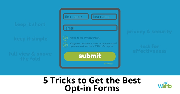
The shorter your form, the more willing people will be to complete it. If the form looks like a test, most will skip it. You should limit the form to 2  to 3 fields. People don’t have patience, and the last thing they’re going to do is take the time to answer lots of questions.

2. You’re asking for information that’s too personal

Most people are uncomfortable giving personal information via the internet. Obviously, you have to ask for a name and email address. Most people realize they have to provide this information.

However, you shouldn’t ask for other information, like phone numbers and company names. This makes people uncomfortable – especially since there are a lot of websites that the sell information they collect.

3. Your leads don’t feel secure

Almost everybody will have second thoughts before they fill out a form on a website. Do they really want to provide you with information that you can use to spam them?

Demonstrate the safety and security of your site to help alleviate these fears by including the following:

  • Social Proof – Add social proof to your landing page. Add the number of shares or likes the landing page has gotten, the number of downloads you’ve gotten (if you’re offering free downloadable content in exchange for filling out the form) or even customer testimonials.
  • Privacy Policy – Provide a link to your privacy policy to reassure leads you won’t sell their personal information. A good place to put the link is under the field asking for their email address.
  • Authority Endorsement – Any endorsements from an authoritative source, guarantees or third-party security certifications should be displayed on the form.

4. You’re not positioning the form above the fold

When a lead arrives on your landing page, make sure your form is in full view. A lead should not have to scroll down the page in search of the form; there’s a chance that they may get distracted and simply forget why they’re there. Always position your form above the fold (meaning the visible area on a web page) so your leads don’t have to search to find it.

5. You’re not testing your forms

Use variations of your forms and do A/B testing to determine which variation is more effective at capturing leads.

Don’t underestimate the importance of your opt-in forms when it comes to capturing leads. Be sure to avoid some of these more common mistakes to make sure your forms are efficient.