Tag Archives: tips for optimizing a lead capture popup

Popup Subscription Forms. Should You Use Them?

Popup Subscription Forms. Should You Use Them?
Pop-ups, pop unders, and interstitials. They’ve been around almost as long as the internet, and they’ve had a reputation as an annoyance nearly as long. People have even created software whose sole purpose is to block these interruptions, so it’s safe to say that they’re not well loved. But people keep using them. Why?

How We Use Popups Today

There was a time when the sole purpose for pop-ups was to make sure high paying ads were seen. That’s part of the reason why they’re annoying and frustrating.

However, and these days, popups are primarily used to promote your own email list and similar subscriptions.

Why This Is Better

There will always be people who are annoyed by popups. The fact is most popups today are related to a site they’re already reading, and interested in. So they’re less likely to inspire anger and frustration.

How to Get More Out of Popups

If we want to get more email subscribers, we need to make sure that people are aware of our lists. The best way to do that is to make subscription forms as visible as possible.

Pop ups are great, but there are several ways to get more from them if you do decide to use them:

  • Keep the design clean and avoid garish graphics, ghastly gifs or blaring music.
  • Limit the information you require. This is true of every form on your site, but even more so with popups. If you can get away with just a name and email address, do it!
  • Use persuasive copywriting on your opt in or opt out buttons. Something like “YES! I want to learn how to X” and “No. I have enough Y already” usually works well.
  • Make sure it’s easy to close the popup. If users can’t close them, they might close your site instead.
  • Set up pop ups so they only show once per visit. That way your visitors aren’t bombarded on every page they visit.

The fact is, popups increase opt-ins from 0.4% for a regular sidebar subscription form to 5.5% overall, and that’s a huge gain that’s hard to ignore.

If you want to grow your list, they’re a great way to do just that. While they can be hit and miss, try testing them, perhaps with different messages to see what works for you.

If your site is a valuable resource, and you’re offering an enticing deal in your popup, you’d be surprised at how much a pop-up subscription form can bring.

Increase Your Email Subscribers with Your Blog Articles

Increase Your Email Subscribers with Your Blog Articles
It’s the digital marketer’s mantra: the real power is in the list. You’ve got one shot to impress a website visitor, but endless opportunities to reach out to your email list subscribers.

Blogs are a great way to capture interest and email addresses, but if yours isn’t exactly a gold mine of signups, then it’s time to make a few tweaks. Our recommendations are:

1. Get Responsive!

Responsive design is so critical that Google and other search engines are penalizing sites that aren’t mobile-friendly, and accessible across platforms. More important than that: if your readers can’t access your blog on their phone, they will go elsewhere.

2. Put Opt-In Forms on Every Page

No one is going to look for your opt-in form. Make it easy. Use simple text. Ask for as little information as possible. Add a big, easy to click button. Finally, put it above the fold.

Did you know that the old “sidebar” forms don’t really work optimally anymore?  It’s good to have one but you need something more to “get in front of” the visitor more clearly.

3. Use the “Skyscraper Method”

The Skyscraper Method technique was developed by Brian Dean of Backlinko, and it’s very simple and very effective.

  • Find the very best content in your niche
  • Figure out how to rework it, rewrite it, and make it BETTER
  • Post your new, improved, viral-ready and completely shareable link bait on your blog
  • Repeat

4. Help People Find What They Need

Even if you have a blog that is Shakespeare worthy in style and has the depth of Neil deGrasse Tyson explaining quasars, you’re not going to get the traction you should be out of it if people struggle to find their way around.

Make sure your navigation is simple and intuitive, and place a search box in a prominent and easy to find place on every page.

5. Add A CTA to Every Post

If you don’t get them to sign up before they read your post, make sure you catch them at the end, by including a call to action (CTA) inviting subscription at the end of your posts.

6. Add a Bounce Popup

Good salespeople never give up, and neither should your site. If your opt-in forms haven’t captured their information, and your CTA fails, add a popup to your site that only appears when people are about to leave without signing up.

Chances are, most visitors who leave won’t come back soon, so you have nothing to lose by disrupting them, and asking them to subscribe.

7. Ask Often and Clearly

Most internet users aren’t sure what they are supposed to do next when they land on most sites. Ask them to take action is often all that’s required. Once they’re on your list, you’ve succeeded in the first step in email marketing and relationship building.

Don’t let your hard work blogging go to waste. Turn your business blog into a marketing machine!  Ready to try a Waftio pop-up or widget?

How to Use Double Opt-in Effectively in Email Marketing

How to Use Double Opt-in Effectively in Email Marketing
In email marketing, the best system for collecting quality email addresses is to use a double opt-in system. This is when subscribers undergo a two-step subscription process.

  • Part 1 – They sign up with their email address at your website.
  • Part 2 – They need to click on the confirmation link sent to their email inbox.

This process is necessary because it protects you. Anyone can type in someone else’s email address. Without a double opt-in system, people who don’t want emails from you may get them. Unsolicited emails are not only annoying,  but they’re also considered spam.

On the other hand, usually, people can’t access someone else’s inbox. So without a click on the confirmation link, no unwanted messages will be received.

Double opt-in also protects you from getting low-quality email address. Anyone who’s really interested in your products or services will confirm their subscription. You can be confident that your marketing efforts are focused on leads that have a high chance of becoming conversions.

Now that we’ve cleared why a double opt-in is important, the next thing to address is how you implement it. From users’ point of view, the additional step in the subscription process can be frustrating. For you, it’s just a click. For them, it’s about switching between browser tabs or apps.

Make it feel less like a task and more like a treat. Here’s how:

Set expectations on the website

Let people know what’s going to happen next, so they know what to expect. When you’re using a double opt-in, the page with the subscription form should let the subscriber know a confirmation email will be sent shortly. A reminder to check their spam folder is good, too.

Don’t forget that even if subscribing to websites is simple; not everyone is tech-savvy. A little help can go a long way for these people.

Write great copy in the email

Skip the generic “click the link to confirm” text. Instead, make a unique customized message that’s interesting, and reflects your brand’s image.

For example, if you’re a running an online shop for designer labels, replace the standard, “Sign up for our mail list” to something like “Be a VIP!”. In this scenario, exclusivity matters, so your copy should get that point across.

Offer a welcome gift

Gratitude goes a long way. A “thank you” message is enough in most cases. But if you really want to stand out to subscribers, go the extra mile and offer them something they want. It can be an exclusive sneak peek, a free whitepaper, a coupon or discount, or anything that’s related to your business.  Describe this in the email and have details appear on the confirmation web page when they have clicked the link.

Double opt-in will not get you as many email addresses as single opt-in. But the email address you get are people that really want to be on your list. In the end, that’s what matters more in conversion.

Save

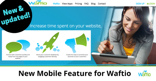
New Mobile Feature for Waftio

New Mobile Feature for Waftio

Early next year, Google will roll out an update to build upon the overall mobile-first use of the Internet by daily web users. Since over half of Google’s searches come from mobile devices, the focus on improving the mobile search is unsurprising. One of the things the upcoming change focuses on is reducing intrusive interstitials (especially pop-ups) that hamper the mobile experience and frustrate users by blocking access to content unless users take action. The following examples of pop-ups violate Google’s new mobile search rules:

  • Interstitials that make content inaccessible immediately after visitors come to the page from the search results
  • Pop-ups users have to dismiss before continuing on the site
  • Pop-ups that mimic the above-the-fold part of the page but the original content is inlined under the fold

Websites that don’t meet Google’s new standards will be penalized. If the content you have worked so hard to produce is visually obstructed by a pop-up (in a way that violates Google’s criteria), the site’s mobile rankings may go down.

In response to this new update, we’ve made a few changes to our Waftio app.

To be helpful to all users of Waftio, we’ve altered the way pop-ups can be used so you have more control.

What does this mean for your website?

We’ve added a feature to Waftio that puts you in control of your site’s mobile user experience with Waftio. Our new update includes the option to disable pop-ups only on mobile devices. This way your site won’t hinder mobile visitors view of your content. Hence, your visitors will have a more pleasant time navigating the site.

This is an optional item to turn on in the Waftio settings area.  We keep you in control and give you the power to continue to grow leads with your website!

Ways to Use Waftio for Your Next Product Launch

Ways to Use Waftio for Your Next Product Launch

Waftio is a set of 3 apps (Survey App, Form App, and Sweepstakes App) all designed to engage your customers and enhance your business at the same time.

You can deploy each one as a landing page, an embedded object, a widget popup, or a popup box. Out of all 4, landing pages and embedded objects are generally acceptable to use, but popups are a little more controversial. The typical visitor is annoyed with popups because they interfere with browsing. There’s nothing subtle about them.

But it’s this lack of subtlety that makes them work so well. They grab attention and demand action when done right. To ensure that you’re tantalizing your visitors more than annoying them, here are some creative ways to use Waftio popups your next product launch:

  • Ask for your visitors’ opinion
    People will feel more engaged if they know their voice counts, so include them in some decision-making processes, no matter how small. Have them vote on a name for a new product, or ask them what they want to see for the next launch.
  • Show them a sneak peek
    A product launch should generate buzz even before its scheduled release. A good way to do this is by offering a sneak peak via an inviting announcement on a popup.
  • Give discounts
    Who doesn’t want a good deal? But don’t give it away too easily. Ask people sign up with their email addresses to get an exclusive promo code. Just make sure your promo is worth their effort.
  • Offer interesting content for download
    When you post relevant information on your site, people are likely to provide their contact information in exchange for additional content. So work on your blog posts first. Once you’ve got that covered, visitors will be looking for ways to contact you instead of the other way around. This makes popups more welcome than usual.
  • Address an FAQ
    It’s frustrating to have to hunt for the FAQ section of a site to get a useful answer. To show visitors that you care about their needs, provide an answer to a few FAQs on a popup. This works so much better if the answer is positive (e.g., Free shipping? We got that covered!)
  • Run a contest with a cool prize
    People will go to great lengths to win a fun freebie, so if your prize is interesting enough, even a popup screen covering the whole page won’t faze determined visitors.

But as interesting as these popups are, give your visitors an easy way out. You can design your popups to be as big and colorful as you want. But make the close button accessible and visible. The last thing you want is for a visitor to leave your site because they can’t get past the popups on the page.

Popups are irritating if they solely serve your business’ purpose, and not your visitors’. Make your popups matter by keeping in mind what your visitors want.

5 Tips to make your Opt-in Form Stand Out

5 Tips to make your Opt-in Form Stand Out

To make sales, you need a customer base. A great way to build your customer base is by adding an opt-in form to your website. After all, an email campaign is more effective when your audience has already expressed interest in your business, instead of a group of strangers who don’t have an idea about your business before hearing from you.

If you want to be successful, you can’t just add an opt-in form and wait for the subscriptions to pour in. Online marketing is so competitive that everything about your website, including the opt-in form, needs to stand out. Gone are the days when you had to stick to a standard form that couldn’t be customized. Now, you can make your opt-in form exactly the way you want.

Though there’s no clear formula, the following guidelines can help you decide the direction you want your opt-in form to take:

  • Make an offer visitors can’t refuse.

    A strong call to action marked by a sense of urgency will get people to move faster. Let’s say you’re a reseller of designer labels, and you have a sale going on. You can use that sale to entice readers to subscribe. “Up to 50% off on luxury brands this summer only! Shop online now!” is more enticing than “Subscribe to our newsletter for sales announcements.”

  • Pique visitors’ interest with a bit of drama.

    Clickbait titles can be annoying, but they’re irresistible. You can apply the same principle to your opt-in form by creating a bit of a teaser. For example, you’re a financial advisor offering your services. Skip the boring text and go with something like “If money doesn’t grow on trees, where does it grow? Find out!” Most people know money grows when you invest it, but the way the question is presented like riddle makes it hard for folks not to be curious.

  • Give visitors a glimpse of what they can expect when they subscribe.

    It’s hard to convince people to sign up if they don’t see the value of subscribing, so why not offer a small taste? If you’re running a fitness site and you want people to subscribe to get access to your exercise programs and meal plans, add a tip to your opt-in form. “Half an hour of brisk walking can burn 150 calories” is a short yet useful tip. You can have the tips change each time the page is refreshed for added variety.

  • Make it entertaining for your visitors.

    Filling out an opt-in form takes time and effort, however minimal. That’s why many people don’t bother. But make it feel less like a chore and more fun. Let’s say you have a bakery and you want to market your cakes and pastries. A picture quiz like “Which dessert speaks to you?” is quick and light. After clicking, visitors can be redirected to a discount coupon they receive when they subscribe.

  • Highlight what visitors would be missing.

    Don’t just put a nondescript “No, thanks” button for people who want to opt out. Put something there that can make them think twice. If you’re running a travel agency, your opt-out button can say “I like to miss out on flight and tour discounts” or “I don’t like to save money on travel.”

Regardless of your niche, these 5 tips will help you design an opt-in form that stands out. To get the best results with the strongest impact, partner your copy with interesting visuals.

Save

Save

Best Practices for a Lead Capture Popup

Best Practices for a Lead Capture Popup

In the constantly improving field of conversion optimization, exit-intent popups are now a big thing. Exit-intent technology leads to more email subscriptions by engaging a visitor just as they are about to leave your site. The popup is your attempt to reach out and create a relationship – so to speak.

The technology is able to react when it detects that the visitor is about to navigate away from the browser page, and initiates to them a popup box. This tool gives you a chance to communicate why the visitor should consider subscribing, offer them something of value in exchange for signing up, and takes advantage of the 10-15% of lost visitors that can be saved and ushered back into the sales funnel.

Let’s learn how to best use exit-intent technologies to capture more leads.

Develop and Bolster Your Email List

You don’t always have to use an exit-intent popup to make a sale; data from Optimonk shows that sites have success in capturing emails for a subscriber’s list, not necessarily a direct sale. In fact, you can recover between 3 to 5% of traffic that you would have lost by installing a popup request to join your email list. Further, boost these numbers by up to nearly 10% by offering an incentive such as a white paper or ebook in exchange for the sign-up.

Use Cart Abandonment to Your Advantage

However, exit intent is a great strategy for e-commerce site sales. It turns out that exit-intent popup technology successfully recaptures about 10% of the business that would otherwise be lost. It can go as high as 15% with certain considerations. For one; remove the email requirement and simply offer an immediate discount if they purchase now instead of abandoning the cart. This can simply involve free shipping – it often works wonders!

The Exit-Intent Redirect Popup

Another use for popups that’s been successful is the redirection option. When the exit-intent tech thinks your visitor may be leaving the site, the popup appears to direct the traffic to another page on your website. It provides you with another shot at conversion if your landing page failed to do it. This may not sound like much, but listen to the data: content redirection popups can recapture up to a 1/4 of leaving visitors! The average is around 10%, which is still quite good – given that you were on the verge of losing them anyway.

Optimize for Simplicity and Speed

The popup can’t take too long to show up – this is crucial. If it takes longer than 200 milliseconds, then you might lose them. This requires preloading the popup since the real-time implementation of the code takes longer than 200 milliseconds. Keep it simple and to the point to further minimize loading times. Plus – you don’t want to overload your visitors with cool but unnecessary graphics. Focus on the content, and keep it concise but informative.

Run Tests Based on Analytics

This pertains to your copy. Not testing your copy means that you’re missing out on opportunities to increase the rate of conversion. There’ve been tests run on exit-intent copy that merely altered a single tagline, which get a 47% increase in conversions!

Don’t wait any longer – sign-up for a free trial of Waftio today to begin taking advantage of exit-intent tech today!Save