Tag Archives: website engagement

How to Market Your Website

How to Market Your Website  Back in the late ‘90s, only a handful of businesses had an online presence, so digital marketing wasn’t very competitive. But it’s a completely different story nowadays. Organizations of all sizes, industries, and sectors are on the internet today, each vying for the attention of their target audience. In order to market your website, you need to optimize it. Fortunately, there are many ways to do this.

To successfully grow your website, it must be:

Fast

Slow websites are not appealing to both people and search engines. Visitors close websites that take too long to load, while Google’s algorithm ranks them lower in search results. Also, with so many other websites to check out, there’s no reason why people won’t switch to faster websites instead. So if you don’t want people clicking X on your homepage, remove the clutter such as too many third-party widgets and non-optimized images.

User-friendly

A complicated layout drives people away. It’s better to stick to something clean, simple, and usable. Ensure that navigation is straightforward so that visitors can browse without getting lost. Also, don’t forget to make your site fit for mobile devices. Because most people use their smartphones and tablets to go online, it’s important for your site to be easily viewable on smaller screens.

Substantial

Content is still king. Marketing can only do so much like attracting more visitors. But engaging with them and making them stay? That’s all about content. Fortunately, you don’t have to rely on just articles if writing long blocks of text is not your strongest suit. With today’s multimedia options, you can create infographics, make posters, shoot videos, produce music, etc. It doesn’t matter what form the content comes in as long as it’s high-quality.

SEO-ready

SEO is still one of the biggest factors that help determine the success of a website. Therefore, don’t ignore SEO when designing your website. Fill out the meta title and meta description, add relevant keywords to your post titles and subheadings, and lastly, supply alt tags with descriptive text for your photos, add keywords to URLs. These little things go a long way in making your website more discoverable by people and search engines alike.

Subscriber-ready

Getting visitors is not enough. What really matters is turning them into potential leads, and one way to do that is capturing their information via a subscription box. But to get people to subscribe, the subscription box should be visible without being intrusive and enticing without being pushy.

Also, it should ask for minimum information such as email address, as opposed to a detailed form with multiple fields. People don’t have the time to fill out a full questionnaire, plus they are less likely to share a lot of information on a website they still don’t know well enough.

Just keep it basic in the beginning; once you’ve established a good relationship with your subscribers, you can ask for more details later on.

A successful marketing campaign begins with a good foundation. Once you’ve built a website with the aforementioned characteristics, you can expect to get stronger results from your campaigns.

Website Best Practices for Lead Generation

Website Best Practices for Lead Generation

The ultimate goal of an inbound marketing campaign is lead generation. Your site can attract a lot of visitors, but if all they do is browse and leave, then your efforts have failed.

To be successful, think of your website as a series of pages with elements that work together to turn a visitor into a potential customer. Lead generation follows a pattern which begins with a blog post, followed by the homepage, ‘about’ section, contact form, and a ‘thank you’ page. Every page corresponds to a step in the marketing funnel, starting with searching for info and ending with a submission of contact details. Let’s take a look at each one:

Blog Post

The blog post is the front liner of your website. It’s what people most often see first when looking for information on search engines. Traffic can come from a link posted on social media. The job of a blog post is to make people aware of your business. It should contain relevant information your target audience finds useful. It should be optimized with the right keywords to rank on the search engine and shared on social media.

Homepage

If your blog post generates interest, visitors will be curious about your business. They’ll go to the home page to learn more about your business and what it does. Make sure your homepage clearly explains what you do and how you do it to make visitors stay on your site and explore more pages. But what kind of details?

Visitors don’t necessarily know what you do. Provide a clear explanation of what your business does and how they help people. So on this page, share testimonials from satisfied customers and site any media attention you’ve gotten. Visitors will find it easy to see the value your business offers from people who have experienced it firsthand.

‘About’ Section

At this point, visitors already know what the business is, but not why it exists and who’s behind it. They want to know your objectives, your values, your vision, and mission. This should be included in your ‘About’ section. This your opportunity to earn visitors’ trust. Humanize your business by introducing yourself and your staff, talking about how the business started and share your vision for the future. People are careful about who they align themselves with. So if a business seems shady, they won’t trust it. Be transparent and open.

Contact Form

If you’ve filled out the first three pages, then it’s a quick step for your visitors to take action like filling out the contact form and leave their contact details. Once you have these, congratulations, you got yourself a lead. You can nurture your leads through email marketing and convert them into paying customers.

‘Thank You’ Page

Although the process of lead generation ends after the submission of a completed contact form, a new process begins right away — nurturing leads. You can start right away by showing heartfelt gratitude beyond the generic “thank you.” On this page, write a personalized message and offer additional value such as an Ebook download and links to more resources.

Do all leads follow this simple flow? Not necessarily, but it should give you a general idea of how visitors behave on websites.

Save

How to Lower your Website Bounce Rate and Increase your Conversions

How to Lower your Website Bounce Rate and Increase your Conversions  Most people these days know that websites are not like baseball diamonds in cornfields. If you build it and don’t market it, no one will come. When readers come to your site, if they don’t stay you will struggle to reach your website goals.

Fortunately, you can reduce your bounce rate (people that come and immediately leave) and increase your conversions. Many of these techniques are fairly quick and simple.

Here is a quick guide list to help you:

  1. Make it simple.

    Users don’t want to struggle to find menus or figure out what your site is for. Make your user experience and navigation easy to understand.

  2. Keep the important stuff above the fold.

    If people don’t see what they want when they land on the site, they’re going to look somewhere else.  “Above the fold” means visible without having to scroll down the page!

  3. A big button that says “click here”.

    Isn’t sophisticated, but it works.  Tell people explicitly what you want them to do.

  4. Work on loading speed.

    You want your site to load as quickly as possible. Visitors get tired of waiting for your site to load and will go elsewhere.  This is especially true on mobile devices.

  5. Create great, user-focused content.

    Your website should be a carefully curated collection of what your visitors want to see and how you can fix their pain points.

  6. Mix it up.

    Articles and blog posts are great, but videos and images are compelling content tools too. Create slideshows, animated explainers and to keep visitors engaged and interested.

  7. Use graphics and images to make your sites interesting and engaging.

    Make sure they’re high quality and well suited to your message you want to get across.

  8. Add customer testimonials to your site.

    People want social proof. They’re far more likely to stay on sites (and eventually make a purchase) if they see that people trust you.

  9. Keep your site fresh and interesting.

    When people land on a site that’s out of date and old fashioned, they assume it’s a forgotten relic, and look for sites that are modern and up to date.

  10. Follow the golden rules:

    Clear fonts, high contrast, and easy to find and navigate menus. You can get creative with a lot of things, but you don’t want to mess with the usability of your site.

  11. If you don’t already have an SSL certificate, get one.

    Websites with SSL protection tend to rank higher because Google now favors secure sites. Users are savvy enough to look for the lock these days.

  12. Always include a call to action.

    Your blog may draw readers to your site, but if you don’t tell them what to do, they might wander off.

These are just a few of the things you can do to improve your site, cut your bounce rate and improve conversions, and they’re some of the easiest. Try them, and track your results. You may find you only need minor tweaks to get a significant impact.

How to Use Social Engagement to Increase Website Traffic

How to Use Social Engagement to Increase Website Traffic

If your company has been resisting social media because of the, well, social part, consider giving it another look.

Social networks can be a simple, yet effective way for new customers to learn more about your business, and for existing customers to build their loyalty. These networks can be places to engage with users in conversations, show off your cool staff and your cooler products and services, get people excited about what you do, and make it easy for them to buy.

Why is it important? Look at the numbers. As of June 2016, Facebook has 1.71 billion monthly active users worldwide, and 1.13 billion daily active users. Twitter has 84 million monthly users and Instagram 200 million. Granted, not all of these users will be interested in your business, but it’s likely that people in your target market will be on one or even all of these networks. And who knows? Given the global nature of the Internet, some unexpected customers in other parts of the world may want what you’re offering.

Companies looking to take their social networking seriously can try these strategies to drive business.

  • Start blogging

    Part of the reason that some companies are intimidated by the idea of social networking is the fear that they always have to come up with interesting things to say. A smarter solution is first to focus on creating and maintaining a company blog. Doing this will accomplish two things: it will give you all sorts of fresh things to talk about on social media and drive people to your site. It will also provide fresh content for people who visit your page. What you don’t want is to have a site that never changes. Newcomers may like visiting once, but you won’t get the return visits you need.

  • Make it easy to interact

    Design your posts to get people talking, whether it’s a current blog post, your thoughts, a photo, or someone else’s post you are sharing. You can throw out a question or a theme and encourage people to respond. Each platform has its own version of “I like this,” such as a thumb’s up, heart or star. But what’s even better is when people share your post. This extends your reach and draws in more people who may not have seen your initial post.

  • Make every path connect

    Include links to your site in every social media post as a call to action. Drive site visitors to your social media. Push your site and social media all in any other communications, such as email newsletters, direct mail, texts, or other marketing materials. This global approach is a good way to get noticed, even if someone isn’t part of one network.

  • Make it mobile friendly

    Desktops and laptops are still used; more people are visiting sites and social media through their mobile devices. When planning your social strategy to drive sales, make sure everything looks good and functions on common mobile devices.

  • Consider “promoting” posts

    Major networks encourage businesses to pay to have their social activity be seen by more users. Posts can also be targeted to appear more in front of certain demographic groups of likely customers (men/women, certain age groups or locations.)

Implementing these keys can help a business drive social traffic to their website.  Combined with a lead capture strategy on the website, this is a strong form of marketing known as social lead generation.  The key is engaging and growing your audience on social and then moving that community over to your website.

How about you?  Are you using social media for lead generation?

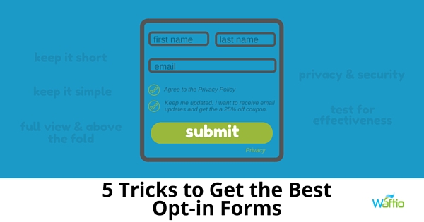
5 Tricks to Get the Best Opt-in Forms

5 Tricks to Get the Best Opt-in Forms

One of the biggest mistakes you can make as a marketer is assuming that if a lead has clicked on your call-to-action, they are as good as converted. The lead still has to fill out your form, which means they can still change their mind and leave your page.

If you find the number of views of your landing page is substantially larger than your lead captures, there could be a problem with your form.

Here are some of the common reasons why your opt-in form is failing to capture leads:

1. You’re asking for too much information

The shorter your form, the more willing people will be to complete it. If the form looks like a test, most will skip it. You should limit the form to 2  to 3 fields. People don’t have patience, and the last thing they’re going to do is take the time to answer lots of questions.

2. You’re asking for information that’s too personal

Most people are uncomfortable giving personal information via the internet. Obviously, you have to ask for a name and email address. Most people realize they have to provide this information.

However, you shouldn’t ask for other information, like phone numbers and company names. This makes people uncomfortable – especially since there are a lot of websites that the sell information they collect.

3. Your leads don’t feel secure

Almost everybody will have second thoughts before they fill out a form on a website. Do they really want to provide you with information that you can use to spam them?

Demonstrate the safety and security of your site to help alleviate these fears by including the following:

  • Social Proof – Add social proof to your landing page. Add the number of shares or likes the landing page has gotten, the number of downloads you’ve gotten (if you’re offering free downloadable content in exchange for filling out the form) or even customer testimonials.
  • Privacy Policy – Provide a link to your privacy policy to reassure leads you won’t sell their personal information. A good place to put the link is under the field asking for their email address.
  • Authority Endorsement – Any endorsements from an authoritative source, guarantees or third-party security certifications should be displayed on the form.

4. You’re not positioning the form above the fold

When a lead arrives on your landing page, make sure your form is in full view. A lead should not have to scroll down the page in search of the form; there’s a chance that they may get distracted and simply forget why they’re there. Always position your form above the fold (meaning the visible area on a web page) so your leads don’t have to search to find it.

5. You’re not testing your forms

Use variations of your forms and do A/B testing to determine which variation is more effective at capturing leads.

Don’t underestimate the importance of your opt-in forms when it comes to capturing leads. Be sure to avoid some of these more common mistakes to make sure your forms are efficient.

The Value of Website Engagement

The Value of Website Engagement

In this day and age, every business knows the value of a good website. A website with professional graphics, high-quality content, and easy navigation makes a positive impression on potential buyers and will help you score sales.

A lesser-known opportunity for a website is engagement, grabbing a person’s attention when they get to your site and encouraging them to interact with your site.  This takes intentionality and often tools to help prompt the engagement.  When done well it helps people to remember your business and builds a positive first connection.

Here are four more benefits of WebSite Engagement

1. Get’s Rid of Searching

Tools that “capture attention” on websites make it easier for a customer to interact with the site. Instead of having to scroll through the site to find a contact page or subscription form, they’ll see the Waftio form spring out at them and can immediately make inquiries or feedback. People are often in a hurry and have limited time to spend on your site. The quicker you get their attention and get them what they need the more engagement you’ll have.

2. Attention-Grabbing

With all the things vying for people attention, from funny YouTube videos to viral Instagram photos, it can be hard to capture a person’s attention online. Tools such as Waftio play into that instant gratification and quick access to tools that jump out on the page and are fun and interactive.

Instead of a plain, boring form which could be easily overlooked, the website visitor will be immediately drawn in by something that jumps out at them. You’ll get more subscriptions, registrations, and inquiries which can lead to potential sales.

3. Learn New Information

Because people have a limited amount of time and attention, if you want feedback on how a product is doing, you aren’t going to get by sending out an email begging customers to take a survey. With Waftio, the shake of the survey form will capture attention, be enticing, and you’ll get more responses.

4.  Share on Social Media

Waftio is different than it’s closest competitors because it has a social component. The tool offers the opportunity to share survey forms on social media upon completing them. Your business will get more exposure, more traffic, and more potential leads will come to your website.

That’s four more ways you can use Waftio to your benefit on your website.  Try the free trial today!